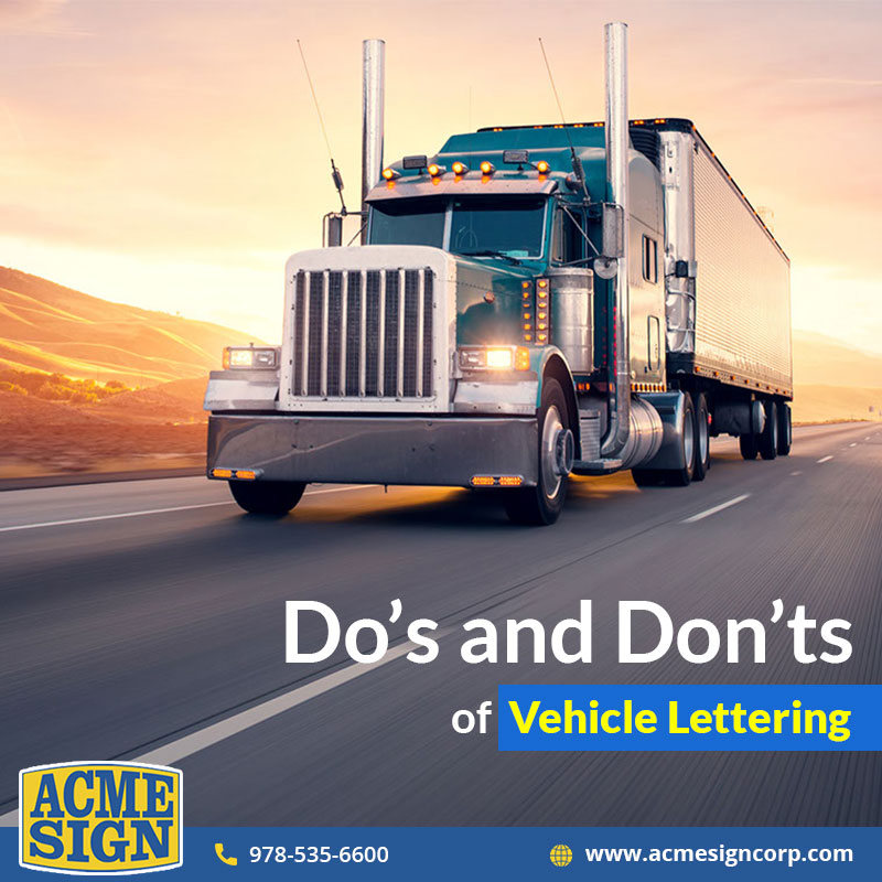
Marketing your brand has become an obvious thing to do, especially with the help of signage that you can easily utilize. One of the most exciting types of marketing signage has to be through vehicle graphics or lettering. Through conventional design, you can not only attract prospective clients but also give a positive vibe through the brand. This blog focuses on the dos and don’ts of vehicle lettering design that you can keep in mind when it comes to making a strong brand impression.

What are Vehicle Lettering and Types of Vehicle Graphics?
Vehicle lettering is considerably distinct in its way than a typical vehicle wrap. However, it includes the addition of an image on a vehicle owned by a particular company. This is mostly used for offline marketing processes for attracting a broader audience by taking the vehicle where the target clients/customer would visit the most.
Vehicle lettering involves a lesser amount of space than what a full or partial wrap would take. Having said so, if you are not careful enough with the maintenance of it, the vehicle lettering might wear off in a year. Both graphics and lettering are similar to their use of vinyl adhesives, which can stick to the surface and look like paint.
Tips to Make Your Vehicle Lettering all The More Impressive
As the owner of a company, you would want your vehicle to stand out from the crowd and make it look all the more attractive. Some of the most favored ways to follow suit are:
No overloading with graphics : Okay! Let’s get this straight. The fact that you have the whole vehicle for advertising your product or service doesn’t mean you would overload it with graphics. The least you can do is mention your tagline, some catchy phrases, and important information about the company, such as contact details and services provided. Too many things going on at once might just make the vehicle look clumsy and unappealing.
A simple and clear font : One of the most important things you must note when it comes to a vehicle lettering design is the use of the font. The flowery font might look attractive, but not always are they visible from a distance, and no one has the time to take a second glance at the vehicle to read. Make it easier for your target clients/customers by using a clear, readable font.
Never use specific brand names : Since your canvas is a vehicle, it can be read from the front, back, and sides. Now, in this case, try to make use of the space by mentioning critical information only, rather than a brand name. When you are discussing with the professional for the work, make sure you discuss this aspect. Be clear of pointers such as which part of the car should be covered for optimum results and which should be left out.
Never use poor quality pictures : One of the largest flaws in vehicle lettering or graphics is the use of poor quality pictures. The last thing you would want is to make use of that much space, but fill it up with bad-quality photos. A fuzzy image or something grainy might harm the appearance of it when printed, and that is why you must always opt for professionally clicked high-quality pictures.
As you keep these things in mind, do not miss your basic message. There must be something or the other that you want to tell your target clients/customers through the lettering. Ensure that you do not get carried away by the work and end up sending an incorrect message. Talk to professional sign makers to perform the job for you.
Conclusion : Acme Sign Corporation is a sign manufacturing company based in Boston that provides vehicle lettering services. If you type “sign repair near me” in your search engine, the company is one of the topmost results. Working in the field for a long time now, the professionals working with the company are adept at their work and render the best of services. Should you want to know more about Acme Sign Corporation or talk to experts regarding vehicle lettering, get in touch by dialing 978-535-6600 or mail info@acmesigncorp.com.


It’s awesome that you mentioned using a clear and simple font. I am looking to tastefully add my company name to my vehicle in a couple of weeks. I thought using a fun font would stand out but now I realize that it may be hard to read.